BlueLine
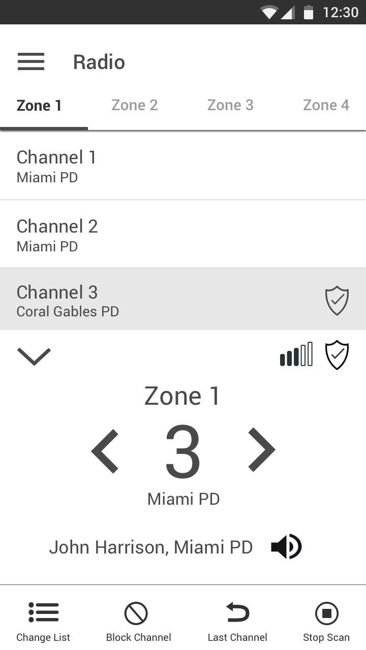
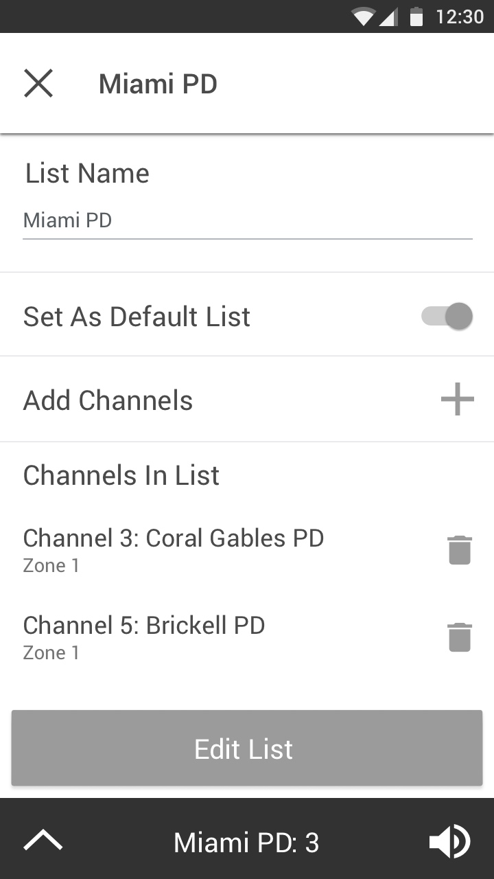
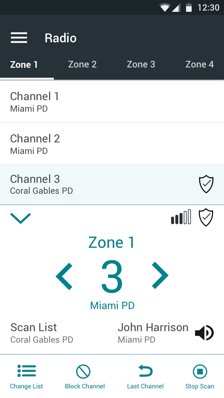
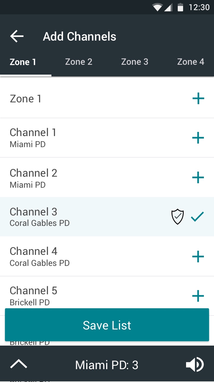
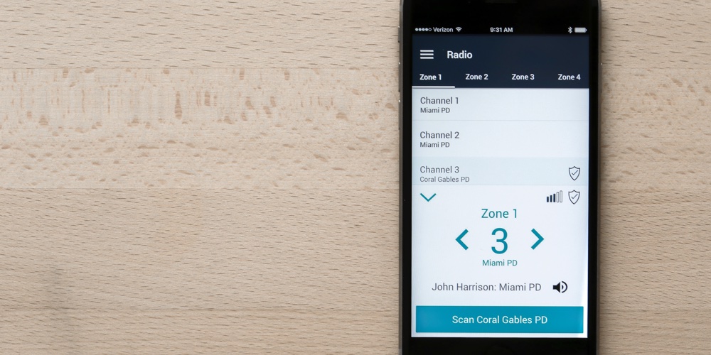
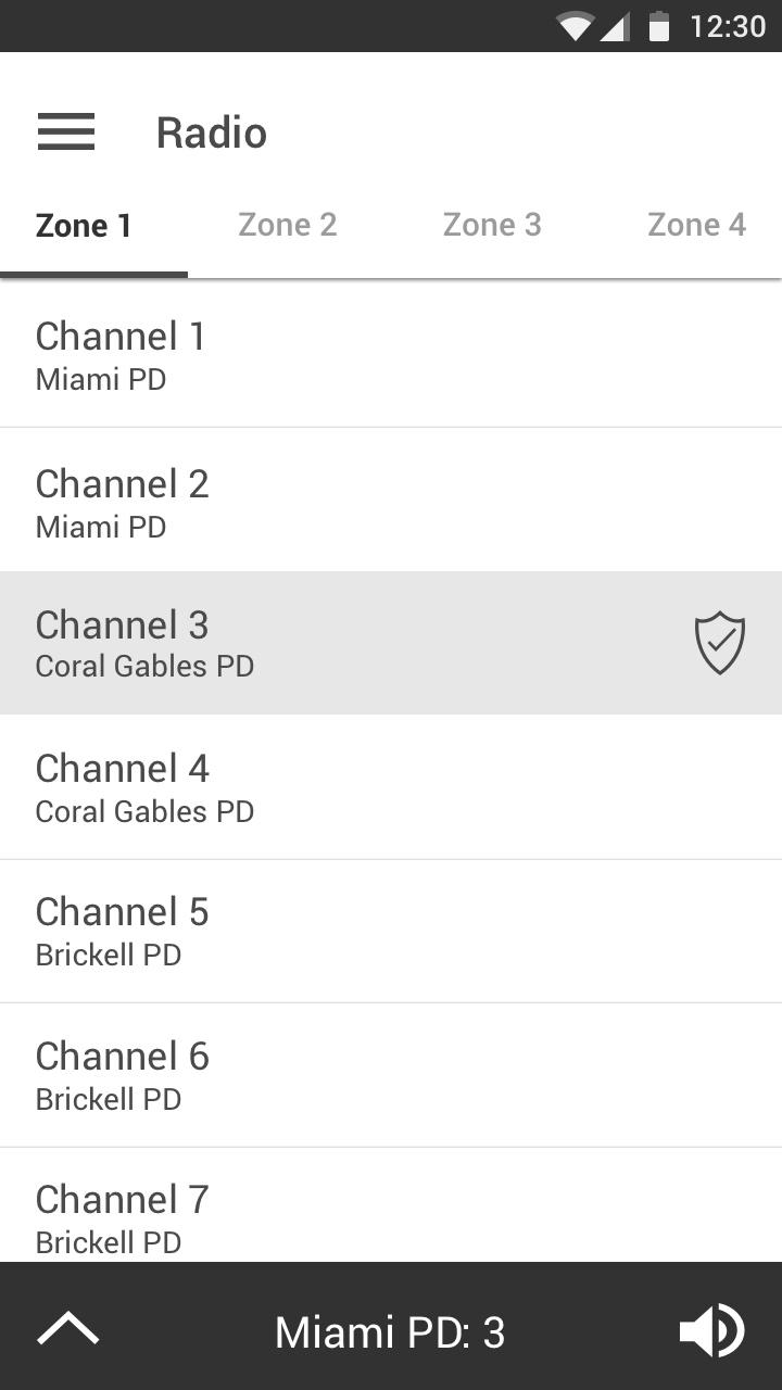
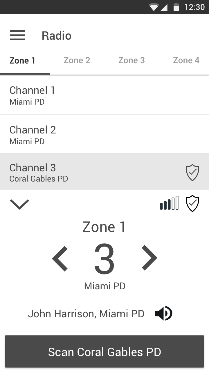
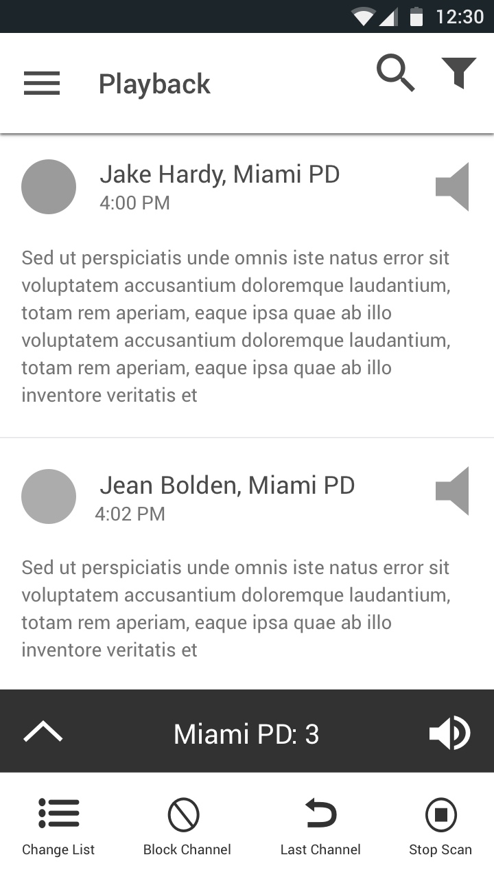
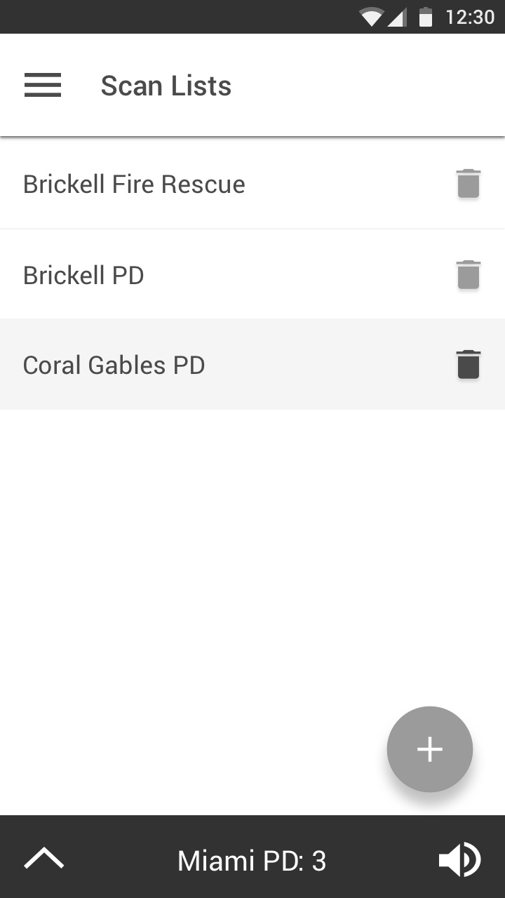
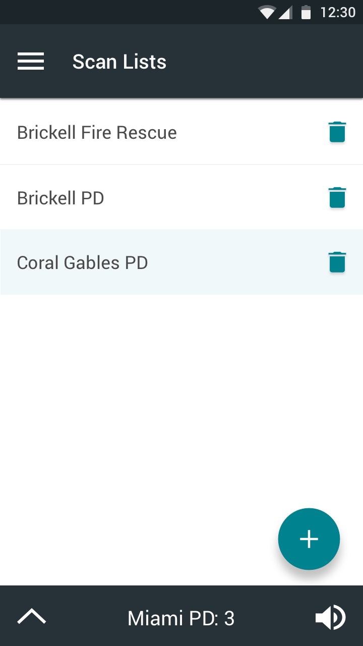
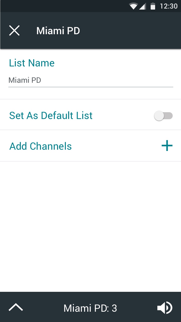
BlueLine transforms the standard public safety radio into a radio application for a touchscreen Android device. This application was designed as a tool for police supervisors. BlueLine allows supervisors more control over their radio, giving them the option to playback radio transmissions, change channels, view channel information, change zones, create scan lists, edit radio scan lists as well as send and receive emergency alerts.
Goal
Transform a standard police radio into a touchscreen application
Role
User experience designer, user interface designer
Team
This was an individual project
Process
To create this application, I first conducted primary and secondary research. This provided me with insight on what features would benefit police supervisors. After gathering information about public safety radios, I began to brainstorm ideas for how the application should function. I started this process by creating a concept map, writing down the features I planned to include in the application and then grouping them together. With a better understanding of the related features, I began to contemplate how different tasks would be accomplished within the application. Creating task flows assisted me in this process. While creating task flows helped me decide how singular tasks should be completed, building a sitemap allowed me to view the application as a whole and make sure nothing was missing. With a clear idea in mind, I began sketching wireframes with pen and paper. When I was comfortable with my sketches, I began digitizing them with Sketch and then annotating them with PowerPoint. After my wireframes were complete, I began designing the application in Sketch. The final step in my process was creating a prototype with InVision.
Research
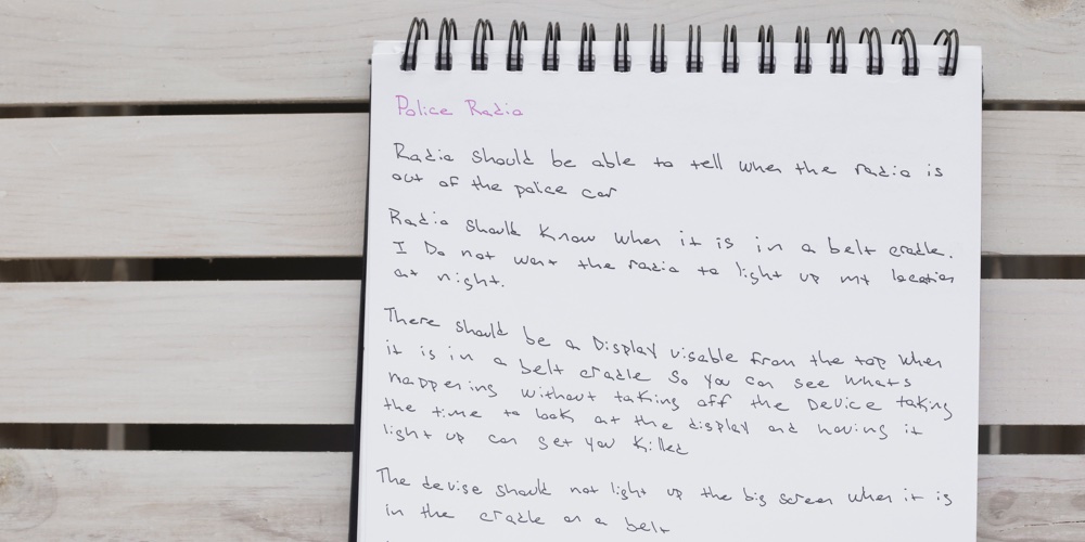
Having never utilized a public safety radio myself, I began my process by researching how a radio works. I started my research online, reading articles and learning about different radios. I quickly learned, while seemingly simple, a radio is an essential part of an emergency responder’s work. While reading information online helped me understand the functionality of a radio, I felt I was still missing key information. I decided to talk to some of the people who use a radio every day. After preparing some questions, I interviewed a police officer and former EMT. Discussing how they use a radio made me realize it would be a challenge to replace physical buttons with a touchscreen device. Reading information online gave me insight on difficulties such as using a touchscreen with gloves or substances covering your hands. Talking with a police officer taught me the importance of being able to quickly silence a device and discreetly send out an alert if backup is needed. While a police supervisor is not always in the field, he or she may be in situations when they would need to utilize these features. This information gave me clarity on how the device should work.
Concept Map
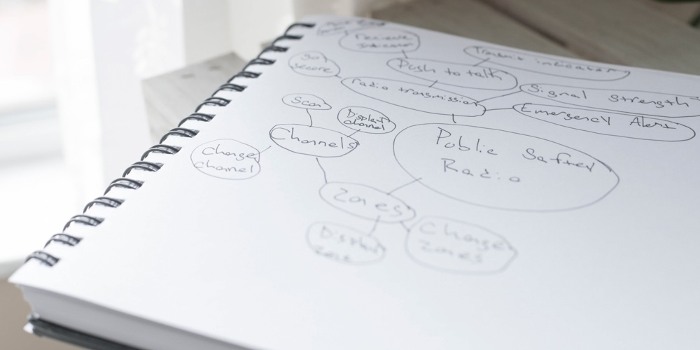
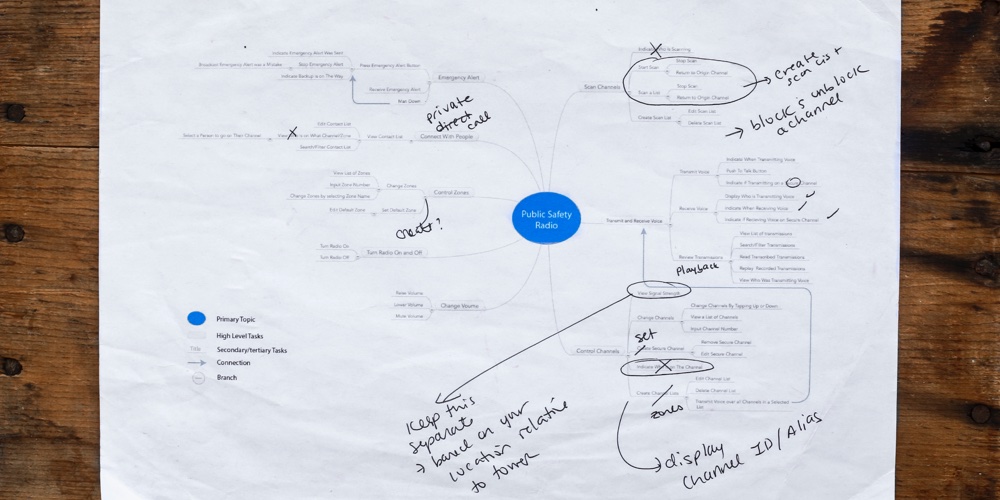
Creating a concept map allowed me to begin writing down features of the device. Viewing all my ideas on paper helped me group together features and remove ones that over complicated the device. Grouping the different features assisted me in visualizing how the application should be structured.
Task Flows
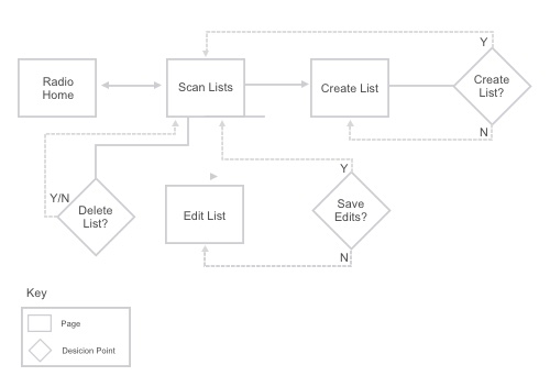
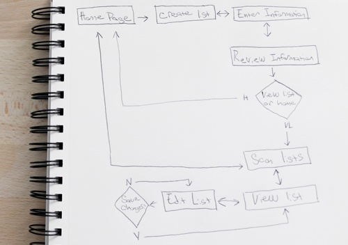
With an idea of the application’s structure in mind, I began to analyze how different tasks might be accomplished. I wanted to make sure nothing was complicated to access, allowing police supervisors to quickly accomplish their goals and continue with their work.
Sitemap
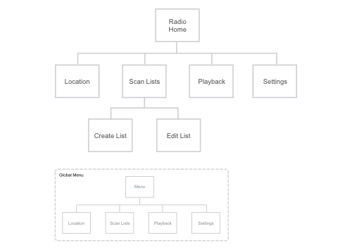
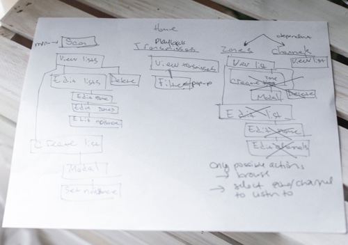
Creating a sitemap solidified my plan and allowed me to view the structure of the application as a whole. This helped me ensure nothing was left out of the application.
Sketches
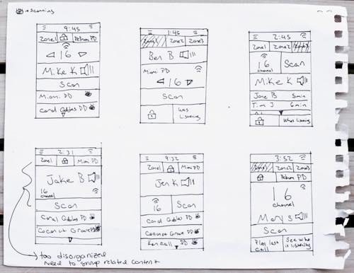
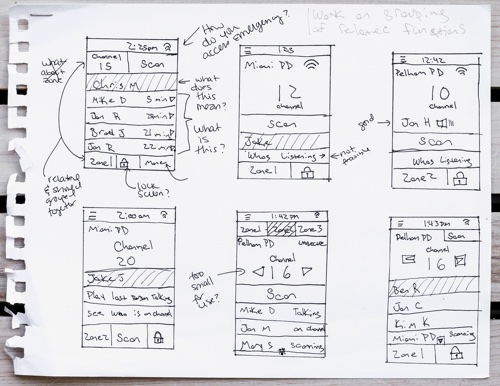
Sketching ideas, I was able to quickly generate multiple concepts detailing potential layouts for the application’s pages. Creating quick sketches with pen and paper was an effective way to view ideas and rule out things that only made sense in my head.
Wireframes
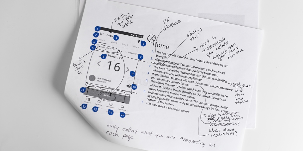
From my sketches, I chose which wireframes would be most effective and began recreating them in Sketch. Because the application would be used on an Android device, I followed material design principles when creating the application’s pages. When the wireframes were complete I annotated them in PowerPoint. Annotating allowed me to think through the functionality of each element and explain how they would interact with users.
Design
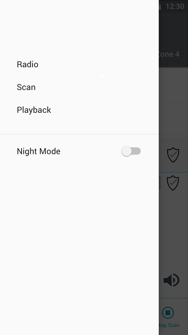
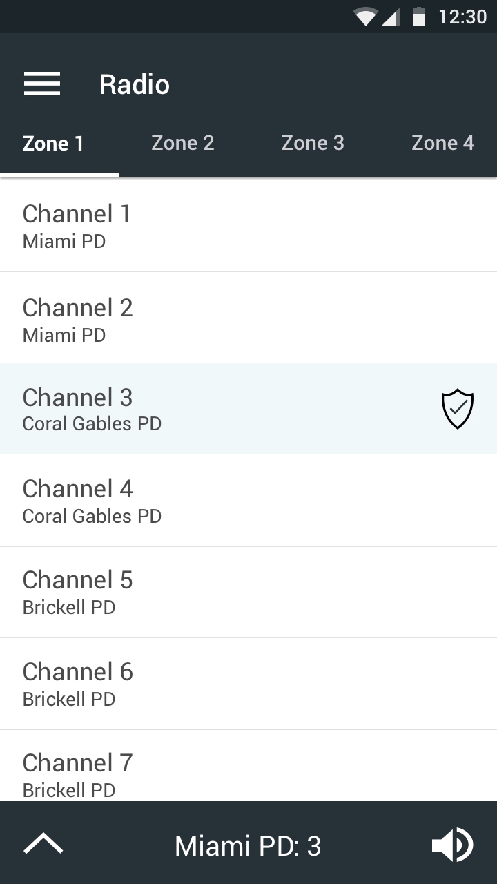
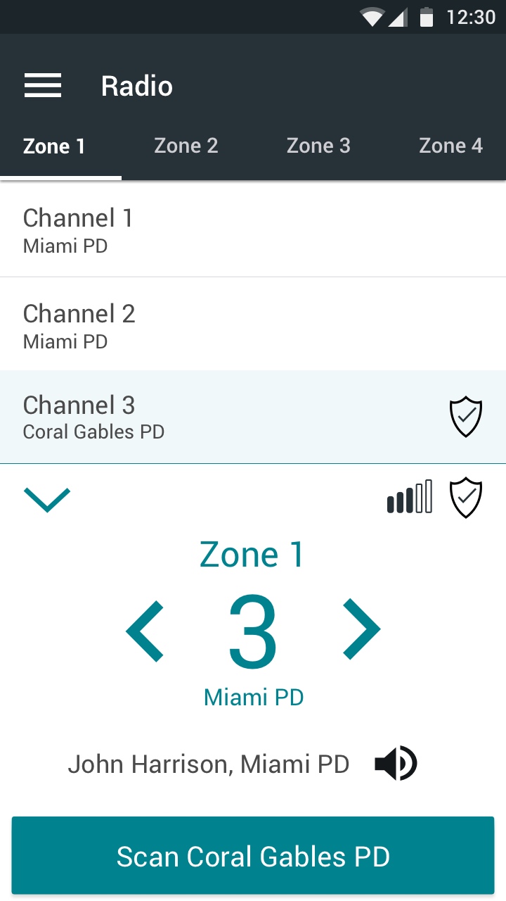
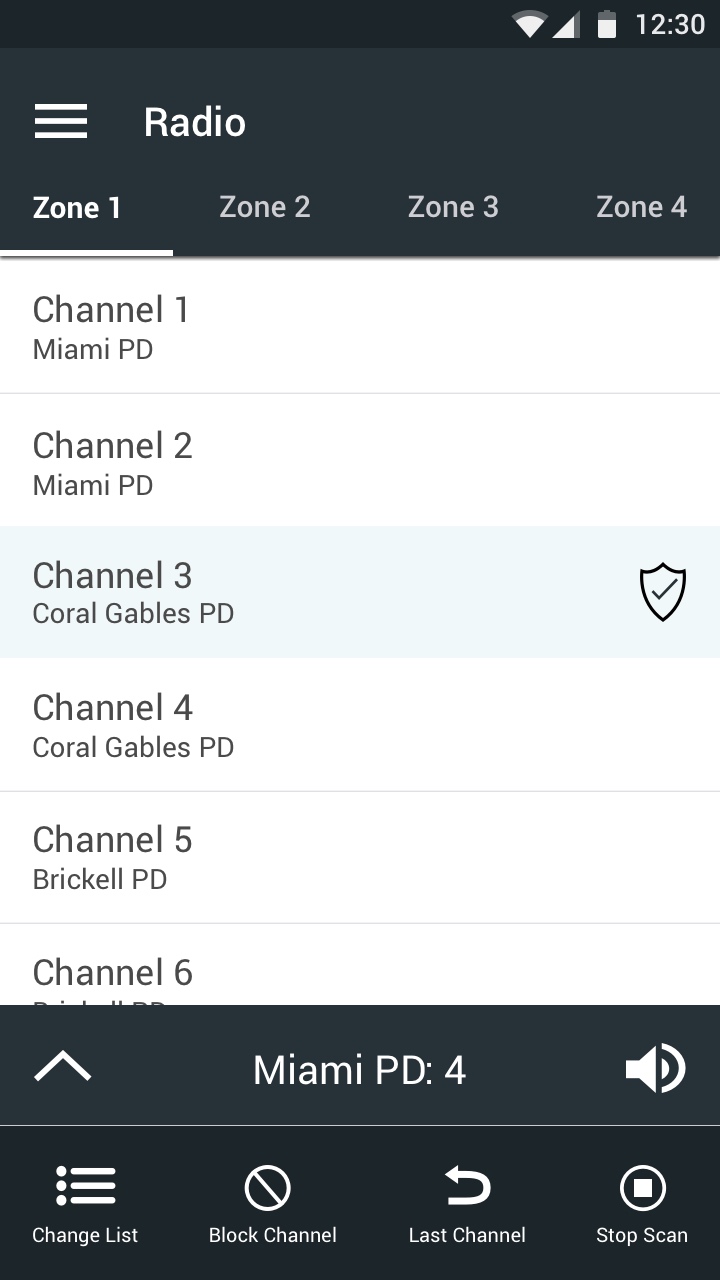
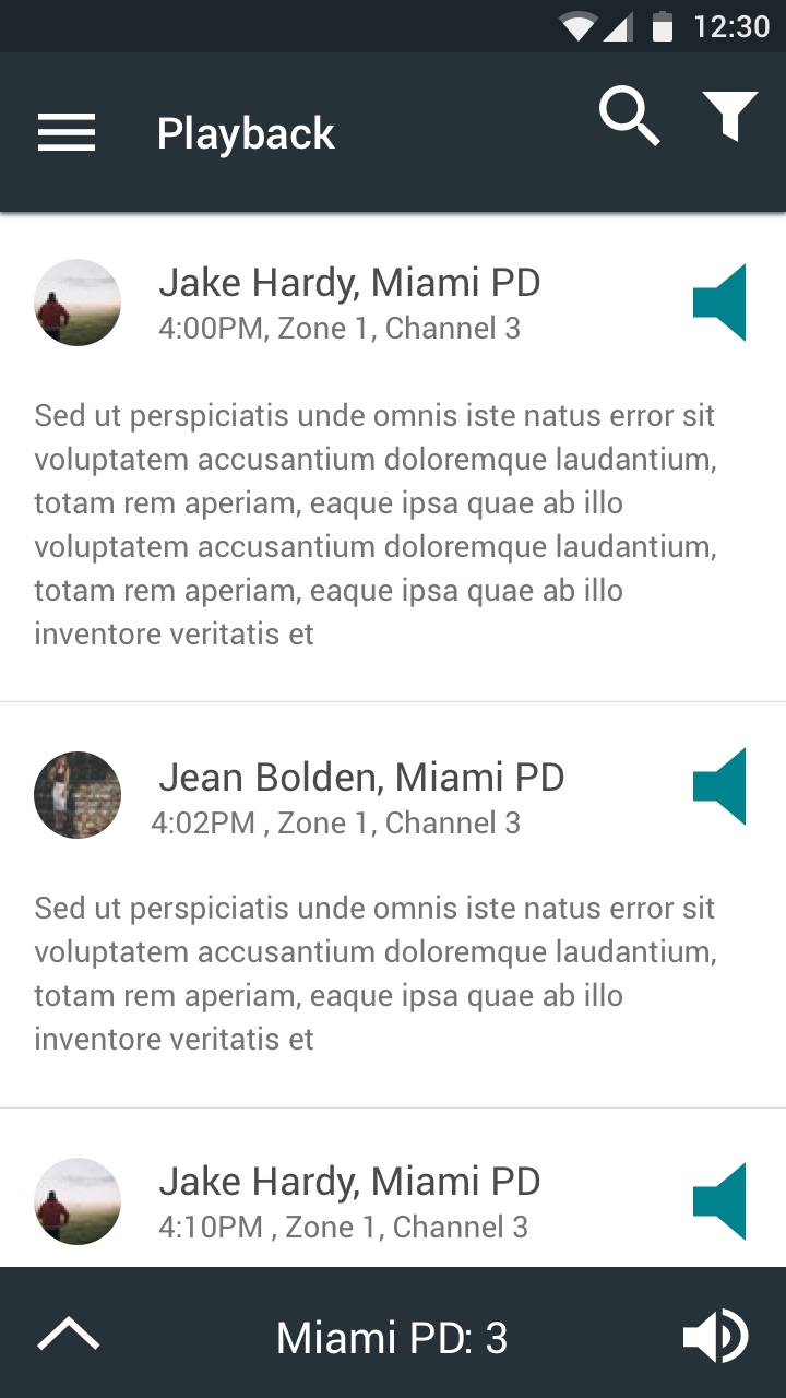
With finalized digital wireframes I began to explore color. Working with an online color contrast checker I made sure all the content would be easy to read and understand. Considering the importance of quickly accessing information from the device, I created a color pallet for both nighttime and daytime. Deciding on suitable color palettes, I began to add color to the application. While the application is simplistic in design, I adjusted my wireframes and icons to be more aesthetically appealing.
Prototype
The final step in my process was creating a prototype using InVision. Prototyping the application allowed me to ensure the application was complete and could function properly.
View Additional Projects
Blueline
Blueline transforms the standard public safety radio into a radio application for police supervisors.
Sunnyside Reporting
Sunnyside Reporting is an online dashboard and reporting tool for nursing home administrators.
On a High Note
On a High Note is an interactive experience merging music, neuroscience and technology.
Homework Forecast
The Homework Forecast assists users deciding when they should complete their homework.
