Park Pass
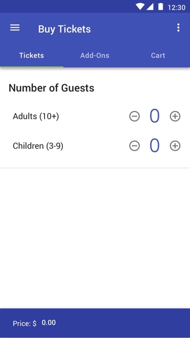
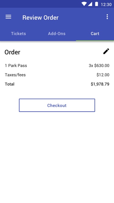
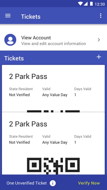
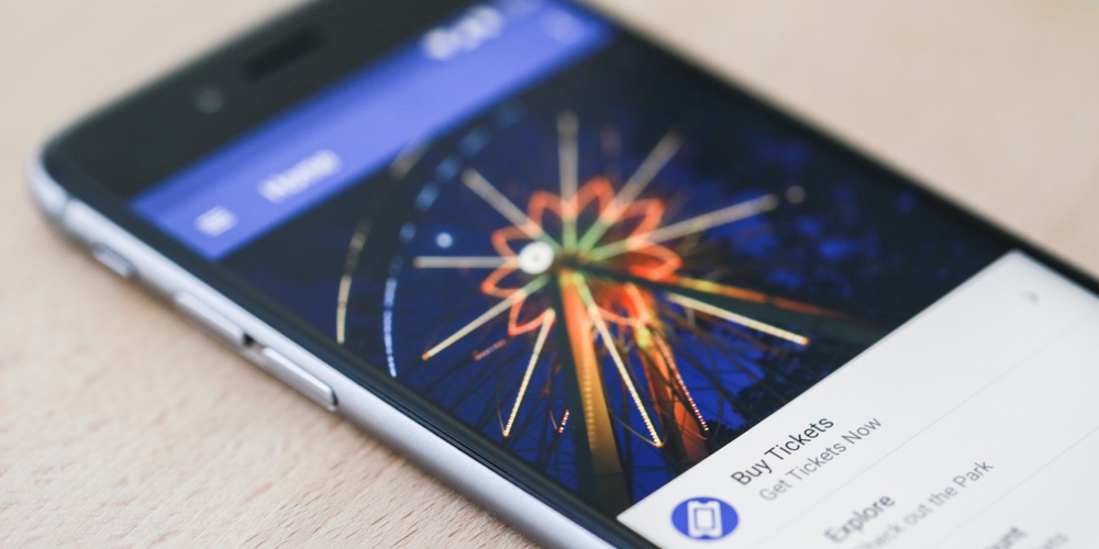
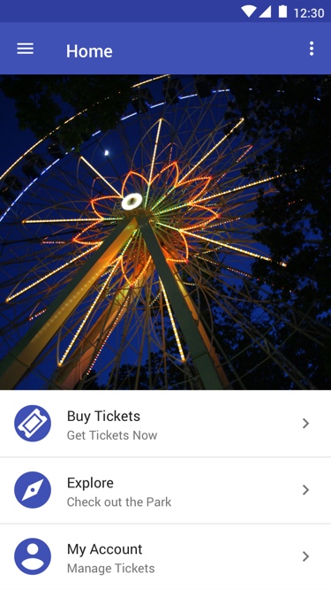
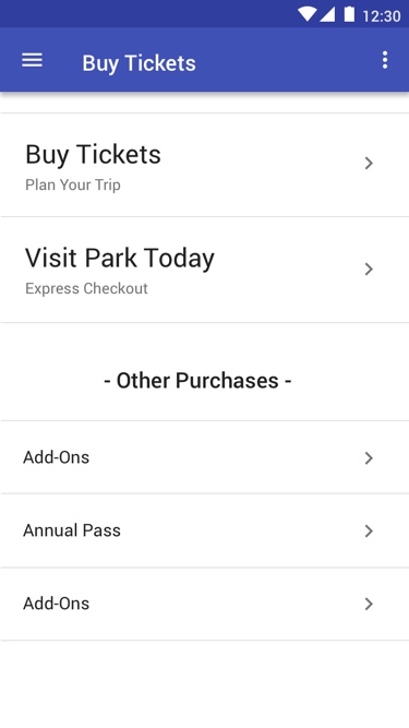
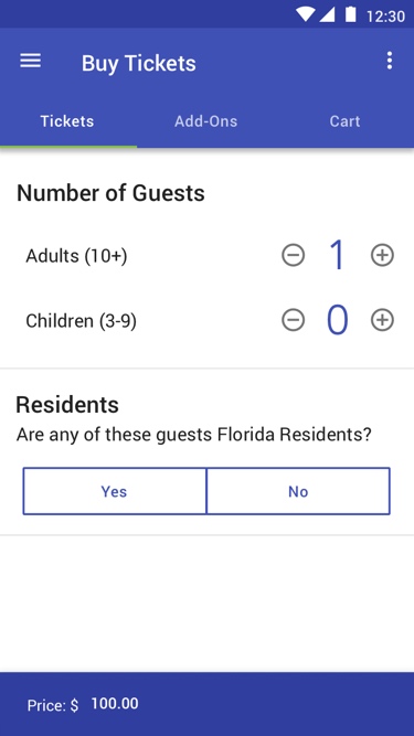
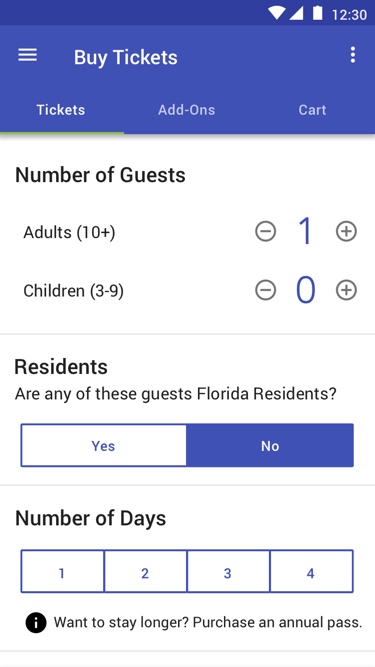
Park Pass is a mobile application created to simplify the process of purchasing tickets for amusement parks online. Through the application, users can view and utilize discounts for state residents, plan a trip to an amusement park and purchase park tickets.
Goal
Simplify the process of purchasing amusement park tickets online
Role
User experience designer, user interface designer
Team
I worked on this project with two University of Miami students
Process
We began our process by conducting primary and secondary research. After exploring information online and conducting interviews, we began to explore how our application might work. We then created task flows to analyze how different tasks would be accomplished within the application. With completed task flows we started sketching wireframes to visualize possibilities for the layout of the application. The next step in our process was digitizing the sketched wireframes in Sketch. We used the digital wireframes to test the application. After testing the application, we made a few changes to the wireframes and then began designing the application. When the application was complete, we created a prototype with InVision.
Research
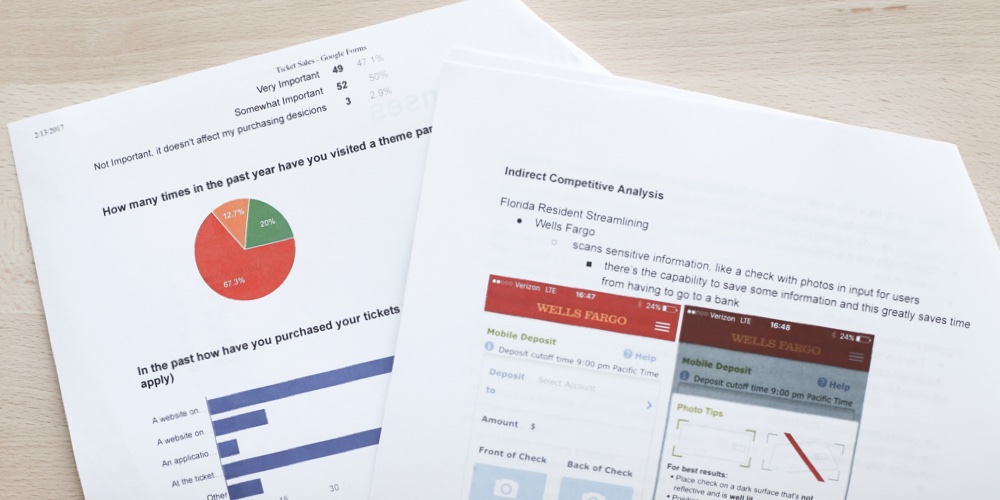
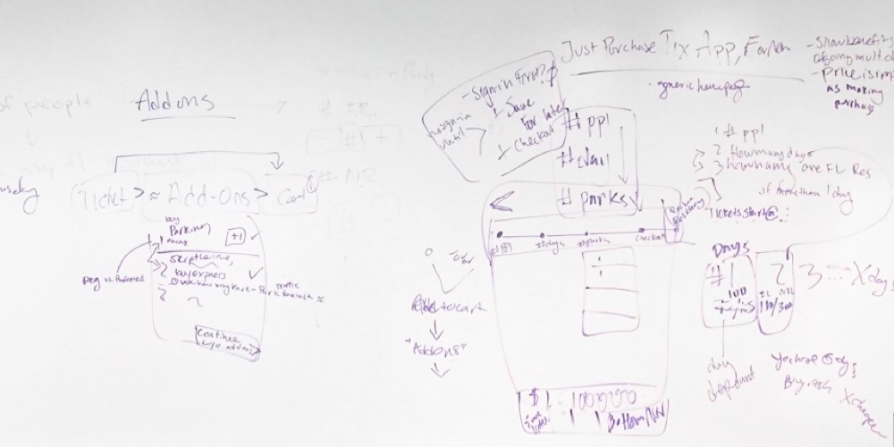
Our process began with research. We researched different amusement parks, learning from a variety of online ticketing systems. In consideration of validating discounts for local residents, we also explored how different banks manage mobile deposits for checks. Primary research was conducted by interviewing different people, asking questions related to their experience purchasing park tickets online.
Task Flows
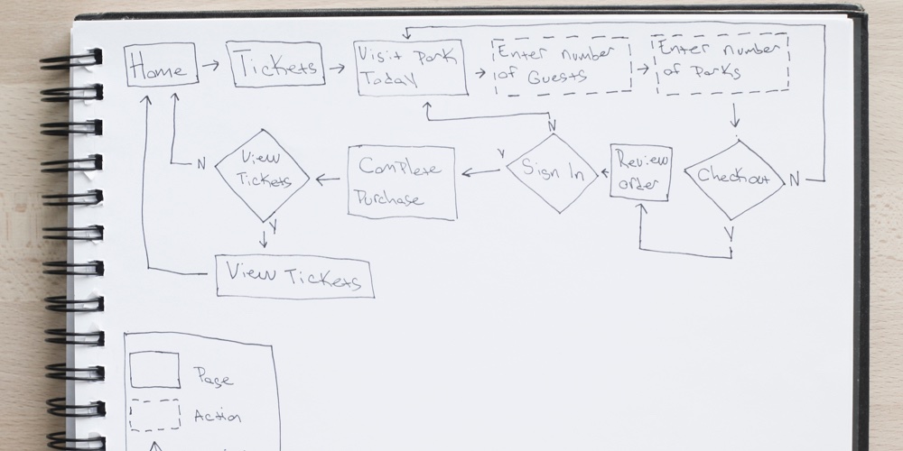
After completing our research we began to create task flows. Sketching task flows with pen and paper allowed us to explore different ways tasks could be completed within the application.
Sketches
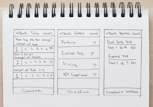
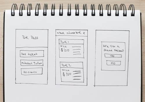
With completed task flows we began to sketch wireframes with pen and paper. We each sketched several ideas for the layout of the application’s pages. When we had created several concepts we came together and discussed our ideas. Discussing our ideas helped us solve any issues and decide which ideas would be most effective for the application.
Wireframes
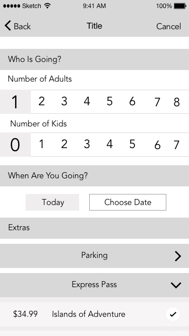
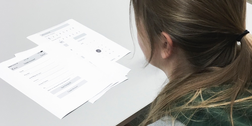
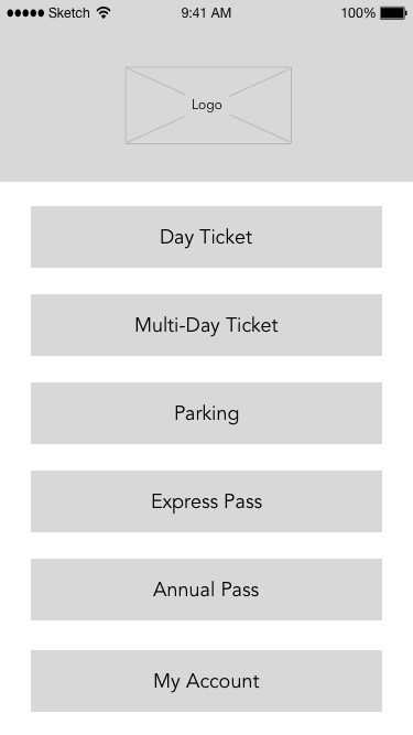
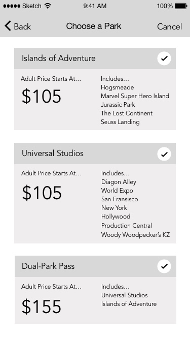
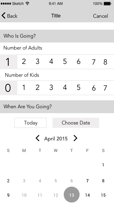
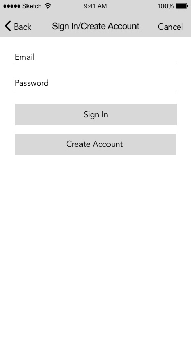
The next step in our process was creating digital wireframes in Sketch. We tested three versions of the application, making changes based on the feedback we received. Testing the wireframes helped us solve any problems with the functionality of the application before it was designed and prototyped.
Design
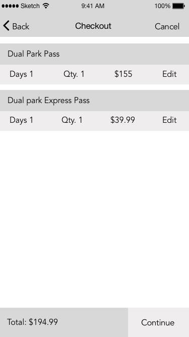
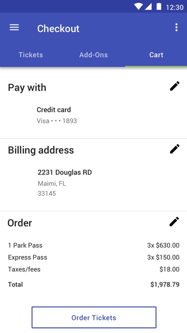
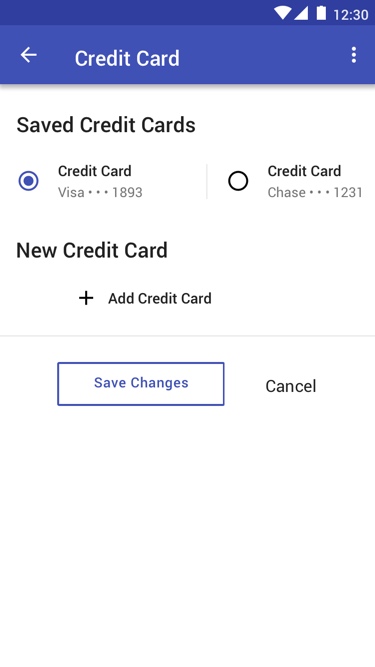
When the wireframes were complete we began designing the application. Designing the application gave us time to analyze each page of the application and make any final changes before we created a prototype for the application.
Prototype
The final step in our process was creating a prototype of the application with InVision.
View Additional Projects
Blueline
Blueline transforms the standard public safety radio into a radio application for police supervisors.
Sunnyside Reporting
Sunnyside Reporting is an online dashboard and reporting tool for nursing home administrators.
On a High Note
On a High Note is an interactive experience merging music, neuroscience and technology.
Homework Forecast
The Homework Forecast assists users deciding when they should complete their homework.
